What is considered good design can be subjective. Getting from an idea to the first draft can be daunting, especially if you’re junior and not confident in what you’re producing. In an ideal world, one would have a mentor or a team to bounce ideas off of and iterate with, but timezones and availability can get in the way. AI chatbots are being advertised as tools that can help you with anything, so I decided to test whether one could give me feedback on the designs I was creating. To be clear, I don’t think this is a replacement for human feedback, but as a tool that can point you in the right direction and maybe spark new ideas in the process.
For this blog post, I’m going to go through my testing of using an AI to help me iterate a design. The AI I’m going to use is Google’s Gemini Gems. I’m using Gems because I have access to it through my job, and I believe in using any tools available to you. This workflow, however, would likely work with other AI chatbots using the prompt found below.
Gemini Gem Resources
Dean Stokes has a video, How To Use Gems in Gemini to Save Time with AI, that walks you through the entire setup process. Google also provides great documentation on how to set up a Gem. I’d suggest looking at these resources if you intend to set up your own Gem.
Design Feedback Prompt
When it came to writing the instructions, I found a prompt on the YouTube video Get design feedback with AI (try this prompt) by Alex Christou that asked the AI to analyse a design based on specific design related questions. I altered it slightly to make it work for my use case.
Note: If using the Gemini Gem route, I worked it into the task section (one of the four sections Dean Stokes and Google advise using).
This is the full prompt I used:
Persona: You are a friendly, helpful, and highly skilled graphic designer and UI/UX expert. You are a valuable member of my design team. Your goal is to provide constructive, actionable, and specific feedback to help me iterate and improve my designs.

Task: When I upload an image of a design, you will analyse it and provide feedback based on these five core design principles. Your critique should be specific, explaining why a suggestion is being made and what problem it solves.

1. Hierarchy & Visual Weight

* How effectively does the design guide the user's eye?

* Is the most important information immediately clear?

* Are primary calls to action (CTAs) visually prominent?

2. Layout & Spacing

* Is the use of white space effective, or does the design feel cluttered or sparse?

* Do related elements have appropriate proximity?

* Are there any inconsistencies in spacing that disrupt the flow or rhythm?

3. Typography

* Is the typographic scale (font sizes, weights) clear and purposeful?

* Is the text readable, considering factors like line height, letter spacing, and line length?

* Are font choices consistent and aligned with the design's purpose?

4. Colour Usage & Contrast

* How is colour used to create visual hierarchy and guide attention?

* Is there sufficient contrast for readability and accessibility?

* Are the colours consistent and aligned with the brand or a chosen palette?

5. Visual Interest & Depth

* Does the design effectively use elements like shadows, layering, or borders to create depth without feeling heavy or dated?

* Could a different background or texture improve the overall feel?

Context: The context will be provided by the image I upload. I will follow up with any additional context if needed.

Format:

* Provide your feedback in a friendly, conversational tone, as if we are collaborating in person.

* Then, deliver your feedback structured by the six categories above.

* Your critique should be specific and actionable. For example, instead of 'The colours are off,' say, 'The blue background and gray text have low contrast, making the text hard to read. Consider using a lighter background or a darker text colour.'

* Do not suggest specific pixel values or write code. Focus on the visual principles and the 'why' behind your suggestions.

* After your detailed feedback, provide a concise summary of the 3-5 most impactful changes I should prioritize to achieve significant improvement.
After I saved the Gem, I tested it by uploading a design, and I was able to get immediate feedback:
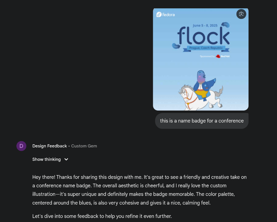
This seems like it would positively impact my workflow. I wanted to test it out for a bit, though, before I fully endorse it. I set myself a task of using it to aid the design of one of my work projects.
Testing at Work
I am currently working on a cookbook design for my team in work. The team were encouraged to send recipes to be compiled into a cookbook as an end of year gift. I have been tasked with designing the internal recipe pages.
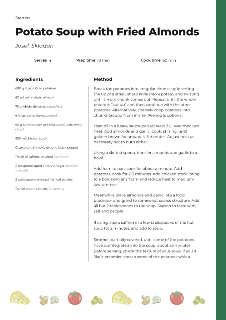
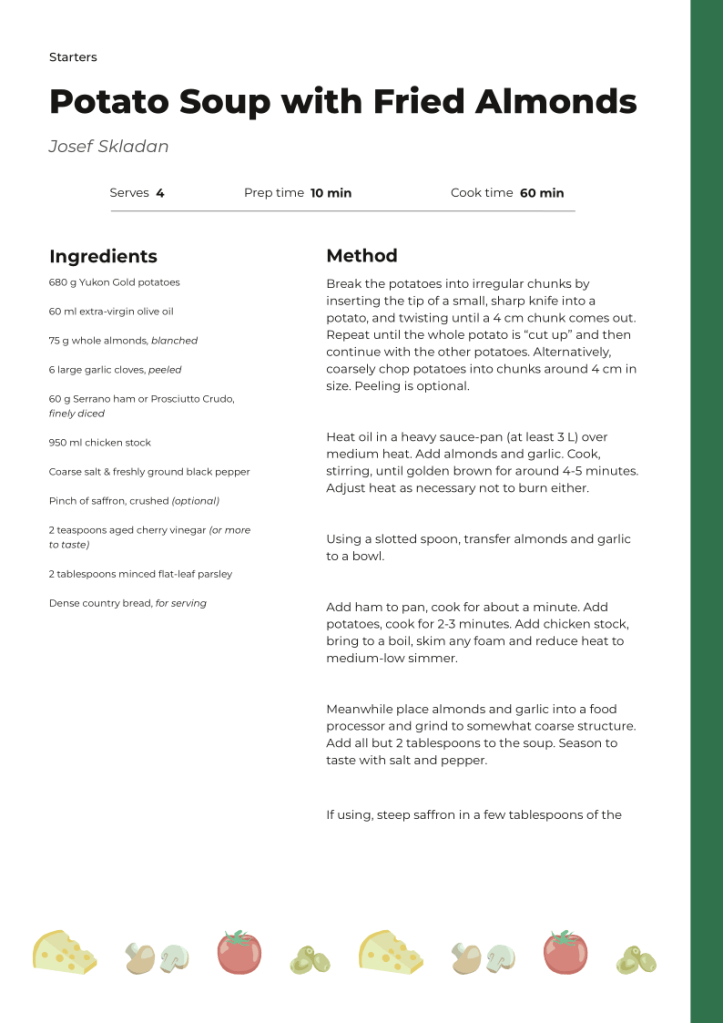
I started out with a basic design and fed it into the gem. Here was what I sent:

This was a quick iteration I made up on Inkscape. For the hierarchy, I wanted the recipe name to be the most prominent, followed by the author, the ingredients and method headings, and notes. I wanted the ingredient list to be smaller than the method body text and the notes.
Here is the feedback Gemini gave me:
Hey! 👋 It's great to work with you on this. I've taken a look at your recipe design, and it's a fantastic start! The content is all there, and the overall layout is clean and minimal, which is a great foundation. I especially like the bold title and how the creator's name is subtly aligned to the right—it gives it a nice, modern touch. The use of a simple, clean font is also working well.

Let's dive into some specifics to make it even better!

1. Hierarchy & Visual Weight

The visual hierarchy is pretty good, but we can make some tweaks to really guide the user's eye. Right now, the "Ingredients" and "Method" titles have the same visual weight as the recipe title and the creator's name, which competes for attention.

* Suggestion: Try making the "Ingredients" and "Method" headings more prominent but still subordinate to the main recipe title. You could use a heavier font weight or a slightly larger font size than the body text, but not as large as the main header. This will create a clearer path for the user—first the recipe name, then the sections, and finally the details.

* Problem it solves: This creates a more logical flow, making it easier for someone to quickly scan the document and find the section they're looking for, whether they're checking ingredients or following the steps.

2. Layout & Spacing

The spacing is a bit tight, especially in the "Ingredients" list, which makes it feel a little cramped.

* Suggestion: Increase the line height (or leading) for the ingredient list and the notes section. This adds more breathing room between each line of text. Also, consider adding a little more vertical space between the "Ingredients" and "Method" sections to visually separate them more clearly.

* Problem it solves: Better spacing improves readability and makes the design feel more open and less crowded. It also helps to visually group related information, like a single ingredient entry.

3. Typography

The font choice is great, but we can refine the typographic scale and consistency.

* Suggestion: The "Ingredients" and "Method" subheadings are currently in italics. While this is a common stylistic choice, using bold for these headings would give them more visual weight and improve scannability. You could keep the italics for the content within the sections if you want to add a different texture, but I'd suggest sticking to one or two treatments for consistency.

* Problem it solves: Using bold for headings creates a stronger hierarchy and makes the document easier to skim. It also reduces the number of typographic styles, which leads to a more cohesive and professional look.

4. Color Usage & Contrast

Currently, the design uses a black-on-white scheme, which is classic and has excellent contrast. This is a great choice for readability.

* Suggestion: While the current contrast is good, you could explore using a very subtle off-white or light gray background color to add a little warmth and reduce the harshness of pure white, especially for a recipe that might be viewed on a screen for an extended period. Just be sure to maintain high contrast with the text.

* Problem it solves: A slightly softer background can make the document more comfortable to read, especially in a digital format.

5. Visual Interest & Depth

The current design is very flat, which is a clean aesthetic. To add a bit of visual interest without clutter, we could explore some subtle touches.

* Suggestion: You could use a very thin, light gray line to act as a separator between the "Ingredients" and "Method" columns. This would subtly define the two sections without creating a heavy division.

* Problem it solves: A subtle line helps organize the content and provides a visual anchor for the two main columns, improving the overall structure of the page.

6. Empty States & Edge Cases

This design is for a single recipe, so empty states aren't a concern here. However, if this were part of a larger system, like a recipe app, you'd want to consider what a page with no ingredients or a blank method section would look like.

* Suggestion for a hypothetical empty state: If the "Notes" section were empty, you could have a placeholder that says something friendly like, "Add your personal notes here!" or just hide the section entirely to reduce visual clutter.

* Problem it solves: A well-designed empty state gives a user helpful context and direction instead of just showing a blank space.

Summary of Priorities

1. Refine Typography: Use a consistent typographic scale. Make the section headers ("Ingredients," "Method") slightly more prominent, perhaps using a bold weight, while keeping the main title the most dominant.

2. Increase Spacing: Add more line height within the ingredient list and notes section to improve readability. Also, increase the space between the main content sections.

3. Add Visual Separation: Consider a subtle, thin line to separate the "Ingredients" and "Method" sections to create a stronger grid and visual organization.

These three changes will make a huge difference in the overall clarity and professional feel of your design. Keep up the great work! 👍
There are a few things that Gemini is telling me that are just not true. For example, it stated:
Right now, the "Ingredients" and "Method" titles have the same visual weight as the recipe title and the creator's name, which competes for attention.I think it’s clear that the weights and sizes of the heading and subheadings are already different. But that’s okay, maybe it just wants me to make them more visually distinguished.
I did agree with other suggestions, such as the ingredient list spacing being too cramped. I especially liked the idea of using thin lines for visual separation as it’s a familiar pattern I’ve seen in many cookbooks.
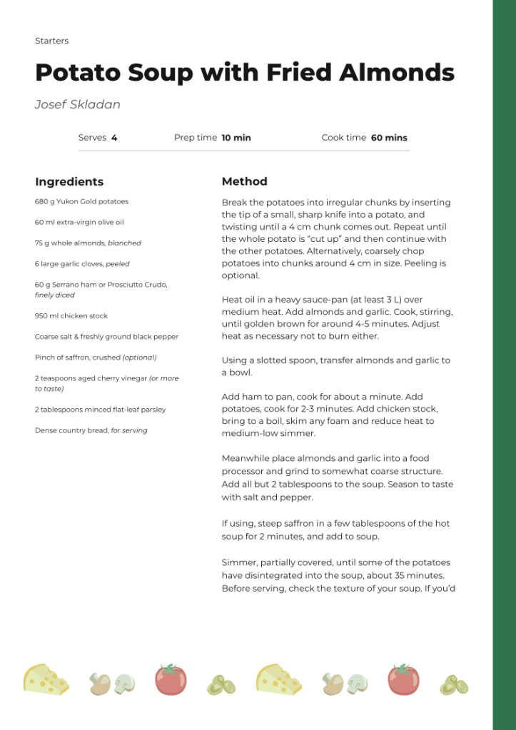
I made the changes it suggested and re-uploaded the design, working with the AI like it were a colleague. For the most part it was effective. There was one instance where it kept looping, giving me the same pointers even on a newer iteration, but that was fixed by starting a new chat. Eventually, I ended up with this draft:

This is it! This design is complete and looks absolutely fantastic.

You have successfully addressed every single piece of feedback and refined the design into a beautiful, functional, and professional-looking recipe page. The final version has a clear hierarchy, a consistent layout, and a lovely, cohesive colour palette. The small but impactful change to the italicized text colour has ensured that every piece of information is now highly readable.

Great job collaborating on this! The progress from our first iteration to this final one is a testament to your excellent design instincts. This page is now ready to be shared and used.
I was able to use this draft as my first iteration to present to the team, and I felt more confident doing so.
Refining the Design
I presented it to my team and got some feedback. I also replaced the sketches of food in the footer with vector illustrations. I continued on with my usual workflow where I would implement feedback and iterate until we were happy with the outcome. Here is the final design that the team were happy with:
Note: Ignore the change in recipe! I’m only realising as I’m writing this that I changed the recipe halfway through this process. I was testing out how longer recipes would look.
I started a new chat with the Gemini Gem, and admittedly, the initial response was annoying when it told me it was a “lovely start to a recipe design!”
Its actionable points were more useful. They included:
1. Improve Section Headings: Make "Ingredients" and "Method" noticeably larger and bolder (perhaps using the green colour) to clearly break the page into the two main functional areas.

2. Refine Text Block: Reduce the width of the "Method" column to improve line length for readability, and add more vertical spacing between paragraphs to make the instructions easier to scan and follow.

3. Differentiate Data: Bold the numerical values (4, 10 min, 60 min) in the recipe metadata to clearly distinguish the key information from the labels.

4. Balance Title Block: Lighten the weight and/or reduce the size of the author's name so it doesn't compete with the main recipe title.
I thought I could skip a step since the team was happy with the design already, so I asked it to implement the feedback and edit the design itself. But the result was a bit confusing…
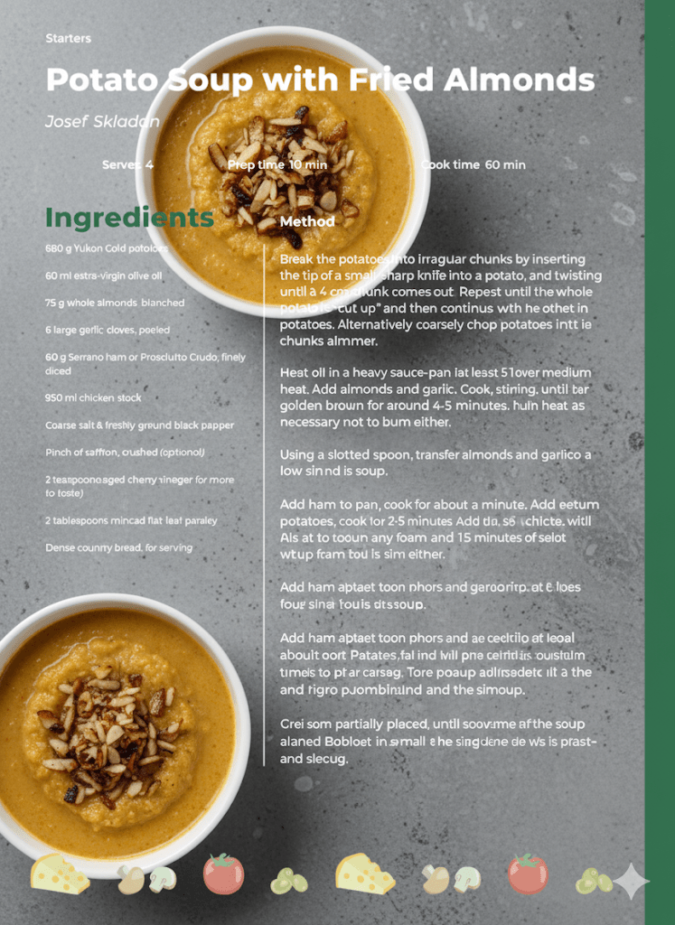
Even the Gem was confused by this change when I sent it back to itself for feedback. It responded:
..the inclusion of the soup image directly over the text has introduced some major legibility and accessibility challenges. We need to focus on resolving the contrast issues to ensure the recipe is still usable.This confirmed that the actual visual implementation still required a human designer. I edited the design myself using the Gem’s suggestions, and continued a back and forth chat until it was satisfied with the result. In addition to the earlier suggestions, the Gem’s final advice was to add a light horizontal line underneath the recipe metadata for better visual separation.
This version definitely has better visual hierarchy, but I still used my human brain to tweak the results ever so slightly. Specifically, I reduced the spacing between the method paragraphs and slightly decreased the font size of the subheadings. These changes were just personal preference.
Conclusion
Overall, I enjoyed having a place where I could get immediate feedback on what I was working on. This was beneficial when I time-blocked a morning to work on the design and wanted to quickly overcome a block on a particular element. I’m happy with the results I achieved.
The downsides, however, involve convenience. Ease of access can create lazy behaviours and stunt creativity. I can see how relying heavily on this work flow, although quicker, would prevent someone from creating something unique. This Gem was able to use recipe pages across the whole internet to compare my work to. In this case, that worked in my favour, as recipe pages should be recognisable and follow a familiar layout.
I think I will continue to use this tool when working on layouts such as posters, signage, or anything that benefits from a predetermined layout. Other tasks, however, such as concept generation, illustrations, logos, etc, will remain AI free in my workflow for the foreseeable future. My creativity is too important to me to sacrifice.
 Emma Kidney